

Key Takeaways
- Start with a fixed element like flooring, a sofa, or artwork to anchor your palette and prevent clashing finishes throughout the house
- Test large swatches on multiple walls and view them at different times of day before committing to any shade
- Neutral tones like soft greens, warm whites, and muted blues tend to appeal to the widest audience and support resale value
- Bold colors work best in smaller doses — accent walls, powder rooms, or trim — rather than across every surface
- Budget-friendly options include sample pots, mistints from the clearance shelf, and painting only high-impact rooms first
- Sheen matters as much as color: flat hides flaws, satin cleans easily, and semi-gloss suits trim and doors
- Coordinating undertones across adjoining rooms creates visual flow and makes a space feel intentional
Standing in the paint aisle with a fan deck in your hand can feel paralyzing. There are thousands of whites alone. Add in the pressure of getting it right the first time — because repainting is nobody’s idea of a fun weekend — and most people either freeze up or grab whatever looks safe.
The good news is that picking the right shades does not require a design degree or a huge checkbook. It just requires a method. If you break the process into smaller decisions, the whole thing becomes manageable, even enjoyable.
This guide walks through the most common problems people run into when picking paint, and gives you a practical fix for each one. Whether you have fifty dollars or five thousand to spend, you can end up with walls you actually love.
Why Do So Many Paint Jobs End Up Looking Off?
The number one reason a finished room feels wrong is that the color was chosen in isolation. People hold a tiny chip up to a wall, decide it looks nice, and commit. Then the paint goes up, and suddenly it clashes with the floor, fights with the sofa, or looks nothing like the swatch under real lighting.
According to The Color House, about three out of four homes have finishes that don’t coordinate properly. That is a staggering number, and it points to a planning problem more than a taste problem. Most of us simply skip the step of looking at how everything will live together.
The fix is to pick an anchor first. Choose something you cannot easily change — the kitchen countertop, the hardwood floor, a favorite rug — and pull your palette from colors that already live in that object. This small shift eliminates most clashing problems before they start.
How To Pick Shades That Match Your Lighting

Lighting changes everything. A cool gray can look serene in a north-facing room and dingy in a west-facing one. Warm beige might glow at sunset and turn yellow under LED bulbs. The chip you fell in love with in the store was lit by fluorescents, which flatter almost nothing.
Before you buy a gallon, grab sample pots. Paint a square at least two feet wide on more than one wall, and leave it alone for a full day. Check it in the morning, at noon, and after dark with your lamps on. If you still love it under all three conditions, you have a winner.
Here are the lighting factors that most affect how a color reads:
- Which direction the room faces, since north light is cool and south light is warm
- The color temperature of your bulbs, measured in Kelvin
- How much natural light the windows let in during the day
- The color of nearby surfaces that bounce light back onto the wall
- Whether trees or awnings filter sunlight before it enters
Once you understand that paint is really just reflected light, choosing becomes less about the chip and more about the environment.
What Colors Actually Add Value to a Home?
If you plan to sell someday, color choice has real financial consequences. Buyers form opinions in seconds, and the wrong shade on a prominent wall can quietly cost you money, sometimes before a potential buyer has even stepped through the front door. Real estate agents often say that a home’s first impression is set within the first eight to ten seconds of a showing, and paint color plays an outsized role in that split-second judgment. This is where learning how to choose paint colors for your home becomes less about personal taste and more about strategy, with each decision measured against what the broadest pool of buyers is likely to respond to favorably.
Zillow’s research found that sage green landed in the top tier for every room they studied, making it one of the safest bets for widespread appeal. The appeal of sage comes from its ability to feel both grounded and fresh, bridging the gap between the gray-dominated palettes of the last decade and the warmer, nature-inspired tones trending now. Soft blues in bathrooms and warm neutrals in living areas also tend to perform well with buyers, with pale sky blues often credited for making small bathrooms feel more spa-like and larger than they really are. Warm greige, mushroom, and creamy off-whites in main living spaces tend to photograph beautifully for online listings, which is where most buyers first encounter your home.
The colors that quietly hurt resale
Not every color helps your bottom line. According to a separate Zillow analysis, yellow exteriors sold for roughly $3,408 below comparable homes in other shades. That is a meaningful discount for what seemed like a cheerful choice, and it’s not the only color that quietly works against sellers. Deep terracotta, bright pink, and strong purple interior walls can also give buyers pause, often because they signal a repainting project before the new owners can even move their furniture in. Dark, moody dining rooms may look striking in design magazines, but buyers tend to deduct mentally for the labor involved in covering them up. If resale is on your horizon, save the bold statements for interior accent spaces where they can be repainted easily, and reserve exteriors for proven, broadly liked tones such as warm whites, soft grays, taupe, and classic navy. For a bigger picture view, you can pair your paint plan with other value-adding renovation projects to make the money you spend on home improvement go further, stacking small, smart choices into a cumulative return that outperforms any single splashy upgrade.
How Can You Use Bold Colors Without Regret?
Plenty of people want color — real color — but worry about commitment. That is a fair concern, because a saturated wall is harder to live with than a magazine photo suggests. Still, playing it entirely safe can leave a house feeling flat and generic.
Behr reports that around 75% of Americans would consider painting a wall or room some shade of red. That tells you something important: appetite for bold color is widespread, even if execution scares people. The trick is to use boldness strategically rather than everywhere.
Try these lower-risk ways to introduce strong color:
- Paint only the back of a bookshelf or the inside of a cabinet
- Choose a powder room, which guests see briefly and remember fondly
- Add a saturated accent wall behind a bed or sofa
- Paint interior doors a surprise color while keeping walls neutral
- Use color on the ceiling, often called the “fifth wall”
Each of these gives you a strong visual punch without turning the whole house into a commitment you might regret in three years.
Picking Paint Shades That Fit a Tight Budget
Painting does not have to be expensive, but costs add up faster than people expect once you factor in primer, rollers, drop cloths, tape, and multiple coats. Being smart about where you spend makes a real difference. Fresh paint is also one of the highest-impact home improvement moves you can make for the money.
Start by prioritizing rooms with the biggest visual payoff. The entryway, the main living area, and the kitchen are seen most often by you and anyone who visits. A bedroom nobody enters can wait another year. Spending your limited dollars where they get noticed produces better results than thinly spreading paint across every surface.
A few money-saving tactics worth trying:
- Ask the paint counter for mistinted gallons at a steep discount
- Buy quality paint for high-traffic rooms and basic paint for closets
- Use sample pots for small projects like a single shelf, a door frame, or a piece of furniture
- Watch for rebates and seasonal sales at major hardware chains
- Skip the primer step by choosing a paint-and-primer-in-one for walls already in decent shape
- Reuse rollers by wrapping them tightly in plastic between coats
The other budget move most people overlook is quantity. Measure your walls carefully and use an online calculator before you buy. Returning unopened cans is possible at some stores, but tinted paint usually cannot go back. Buying one extra gallon “just in case” is how closets fill up with half-used cans you will never touch again.
How Do You Make Colors Flow From Room to Room?
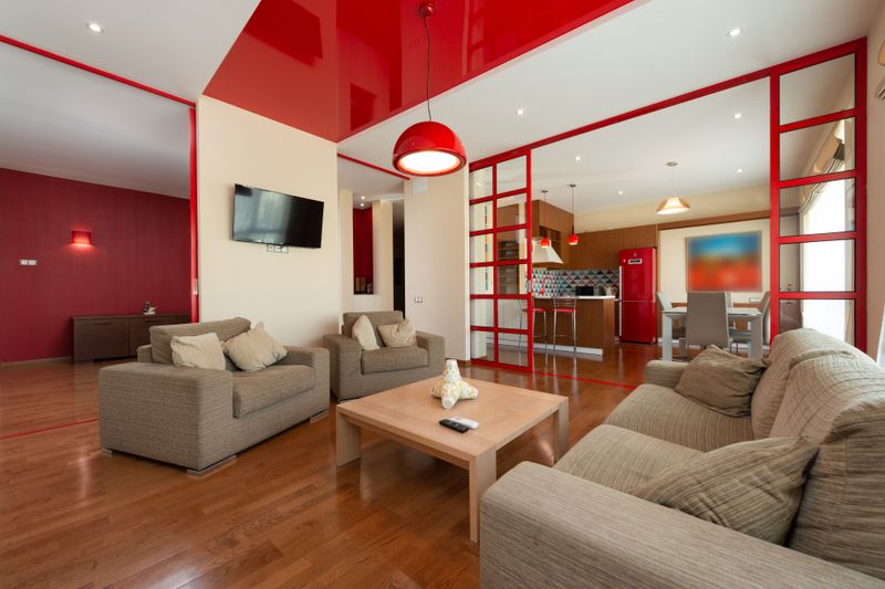
A house that feels calm usually has a palette that carries through the whole floor plan. That does not mean every room is the same shade. It means the colors share a family — similar undertones, consistent warmth or coolness, and a shared relationship to the trim and flooring.
Start by picking three to five colors that work together, then assign them across your rooms based on function and light. A soft greige in the hallway can lead into a deeper green in the dining room and a crisp off-white in the kitchen without any of them fighting. The eye reads the transition as intentional rather than random.
Matching undertones across spaces
Every neutral has an undertone hiding underneath it — pink, yellow, green, blue, or violet. Two whites that look identical on the chip can clash violently on the wall because their undertones disagree. Hold your samples next to a sheet of pure white printer paper to reveal what is really going on. Whatever undertone you see, carry it through the rest of your palette so the rooms speak the same visual language.
Does Sheen Really Matter That Much?
Sheen is the most underrated decision in the whole process. Two cans of the exact same color in different finishes will look like two different paints once they dry. Flat absorbs light and hides imperfections, which makes it perfect for ceilings and older walls with dings. Eggshell and satin bounce a little more light and wipe clean, which is why they dominate living areas and kids’ rooms.
Semi-gloss and gloss belong on trim, doors, cabinets, and anywhere you need durability or a crisp edge. The higher the sheen, the more every bump and brushstroke shows, so surface prep matters more as you move up the scale. A quick rule of thumb:
- Flat or matte for ceilings and low-traffic bedrooms
- Eggshell for most living spaces
- Satin for hallways, kitchens, and bathrooms
- Semi-gloss for trim, doors, and cabinetry
- Gloss for furniture or dramatic accent features
Mixing sheens within a single room — flat walls with semi-gloss trim, for example — adds depth without introducing a second color.
Conclusion
Picking paint is really a series of small, honest decisions rather than one giant leap of faith. Anchor your palette to something permanent, test large swatches under your actual lighting, and respect what undertones are telling you. Do that, and the odds of ending up with a room you love go way up, no matter how much you spend.
Budget shapes the scope of the project, not the quality of the result. A single carefully chosen gallon on the right wall can transform a space more than a whole-house repaint done in a hurry. Spend where the eye lands most often, save where it does not, and let the leftover energy go into prep work, which is what separates an amateur finish from one that looks professionally done.
Finally, give yourself permission to change your mind. Paint is the most forgiving material in any house. If a color does not work after a season, you have learned something valuable about your light, your taste, and your space — and you can repaint. Start with one room, trust the method, and build from there.